Number input
Color
| Element | Property | Color token |
|---|---|---|
| Label | text color | $text-secondary |
| Number | text color | $text-primary |
| Field | background-color | $field * |
| border-bottom | $border-strong * | |
| Controls | svg color | $icon-primary |
* Denotes a contextual color token that will change values based on the layer it is placed on.

Number input example
Interactive states
| Element | Property | Color token |
|---|---|---|
| Field:focus | border | $focus |
| Controls:focus | border | $focus |
| Field:invalid | border | $support-error |
| Error icon | color | $support-error |
| Error message | text color | $support-error |
| Label:disabled | text color | $text-disabled |
| Field:disabled | background-color | $field * |
| border-bottom | transparent | |
| Number | text color | $text-disabled |
Typography
Number input labels should use sentence case, with only the first word in a phrase and any proper nouns capitalized.
| Element | Font-size (px/rem) | Font-weight | Type token |
|---|---|---|---|
| Label | 12 / 0.75 | Regular / 400 | $label-01 |
| Field input | 14 / 0.875 | Regular / 400 | $code-02 |
| Error message | 12 / 0.75 | Regular / 400 | $label-01 |
Structure
The add and subtract icons can be found in the icons library.
| Element | Property | px / rem | Spacing token |
|---|---|---|---|
| Label | margin-bottom | 8 / 0.5 | $spacing-03 |
| Field (default) | height | 40 / 2.5 | – |
| border-bottom | 1px | – | |
| Number | padding-left | 16 / 1 | $spacing-05 |
| Controls | padding-left, padding-right | 16 / 1 | $spacing-05 |

Structure and spacing measurements for a number input | px / rem
Sizes
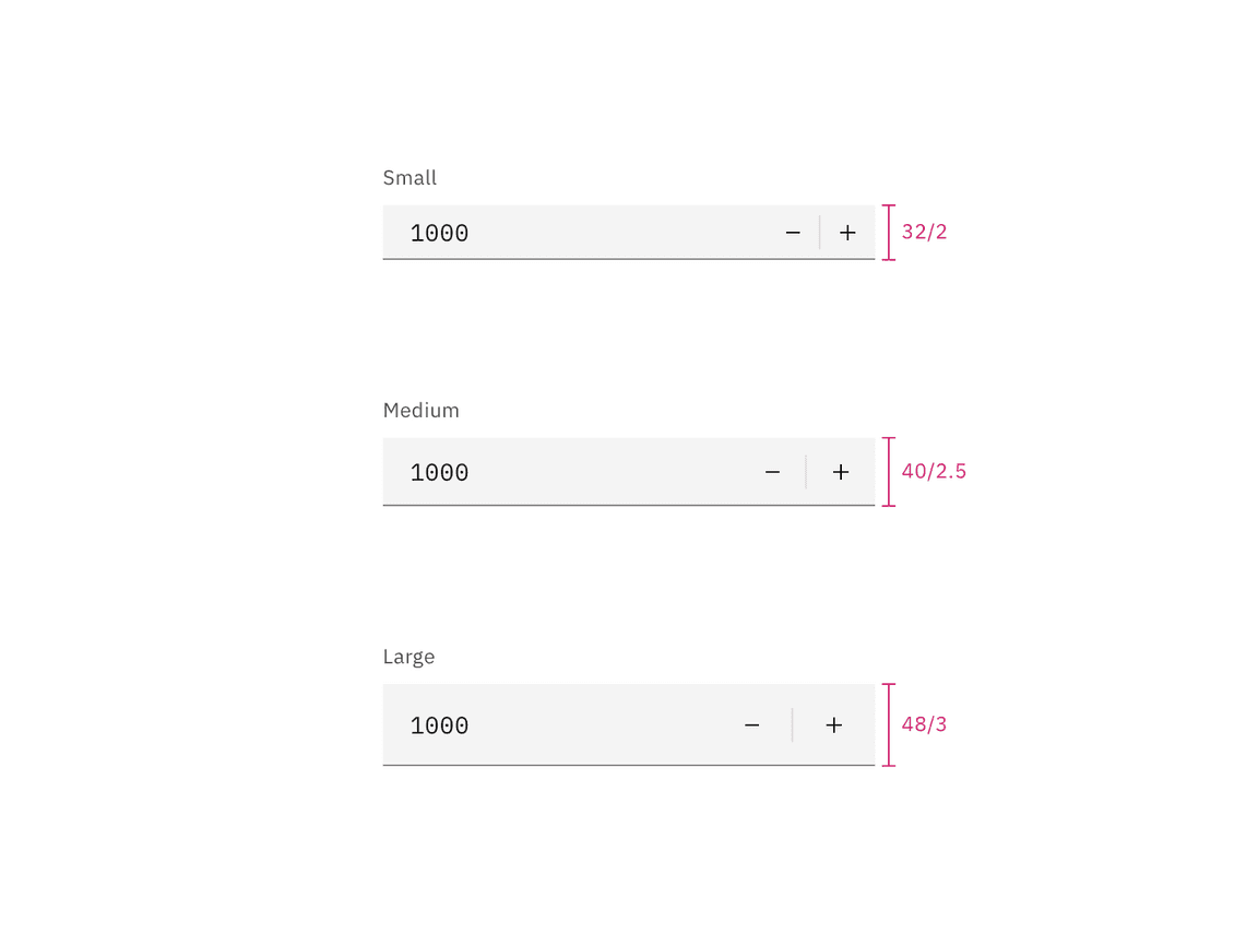
The height varies for each size variant and the the width varies based on content, layout, and design.
| Element | Size | Height (px/rem) |
|---|---|---|
| Field | Small (sm) | 32 / 2 |
| Medium (md) | 40 / 2.5 | |
| Large (lg) | 48 / 3 |

Sizes for number input fields | px / rem