| Class | Property | Color token |
|---|
.bx--slider__thumb | fill | $icon-primary |
.bx--slider__filled-track | background-color | $border-inverse |
.bx--slider__track | background-color | $border-subtle * |
.bx--label | text color | $text-secondary |
.bx--slider__range-label | text color | $text-primary |
* Denotes a contextual color token that will change values based on the layer it is placed on.
| Class | Property | Color token |
|---|
.bx--slider__thumb:focus | border | $focus |
.bx--slider__thumb:active | fill | $interactive |
.bx--slider__filled-track:active | background-color | $interactive |
.bx--label:disabled | text color | $text-disabled |
.bx--slider__thumb:disabled | fill | $icon-disabled |
.bx--slider__track:disabled | background-color | $border-disabled |
Slider labels should be set in sentence case, with only the first word in a
phrase and any proper nouns capitalized, and no more than three words.
| Element | Font-size (px/rem) | Font-weight | Type token |
|---|
| Label | 12 / 0.75 | Regular / 400 | $label-01 |
| Range label | 14 / 0.875 | Regular / 400 | $code-02 |
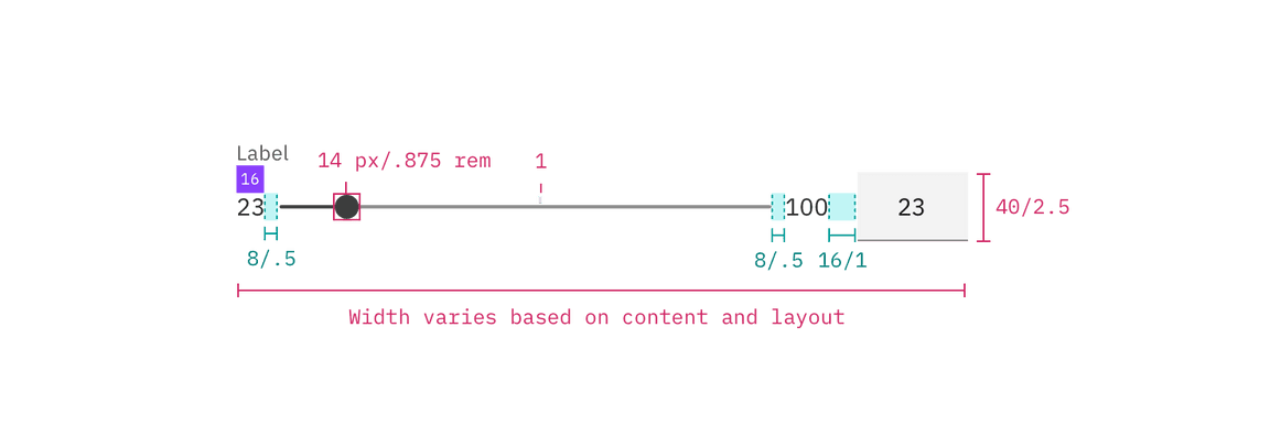
The width of a slider varies based on page content and layout.
| Class | Property | px / rem | Spacing token |
|---|
.bx--slider__thumb | height, width | 14 / 0.875 | – |
.bx--slider__thumb:active | height, width | 20 / 1.25 | – |
.bx--slider__track | height | 4 / 0.25 | – |
.bx--label | margin-bottom | 16 / 1 | $spacing-05 |
.bx--slider__track | margin-left, margin-right | 8 / 0.5 | $spacing-03 |
.bx--slider__range-label:last-of-type | margin-right | 16 / 1 | $spacing-05 |
The following specs are not built into the slider component but are recommended
by design as the proper sizing for the slider tracking line.
| Class | Property | px / rem | Spacing token |
|---|
.bx--slider-track | min-width | 200 / 12.5 | – |
.bx--slider-track | max-width | 640 / 40 | – |
