Structured list
Color
| Class | Property | Color token |
|---|---|---|
.bx--structured-list-th | text color | $text-primary |
.bx--structured-list-td | text color | $text-secondary |
.bx--structured-list-row--header-row | border-bottom | $border-subtle * |
.bx--structured-list-row | border-bottom | $border-subtle * |
* Denotes a contextual color token that will change values based on the layer it is placed on.
Interactive states
| Class | Property | Color token |
|---|---|---|
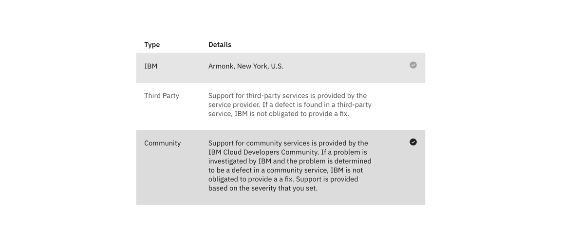
.bx--structured-list-row--selected | background-color | $background-selected |
.bx--structured-list-svg:checked | fill | $icon-primary |
.bx--structured-list-row:hover | background-color | $background-hover |
.bx--structured-list-row:focus | border | $focus |
Typography
Structured list headings should be set in title case, while all other text is set in sentence case. All typography is left aligned.
| Element | Font-size (px/rem) | Font-weight | Type token |
|---|---|---|---|
| Heading | 14 / 0.875 | SemiBold / 600 | $heading-compact-01 |
| List text | 14 / 0.875 | Regular / 400 | $body-01 |
Structure
| Property | Property | px / rem | Spacing token |
|---|---|---|---|
.bx--structured-list | min-width | 500 / 31.25 | – |
.bx--structured-list | min-width | 500 / 36 | – |
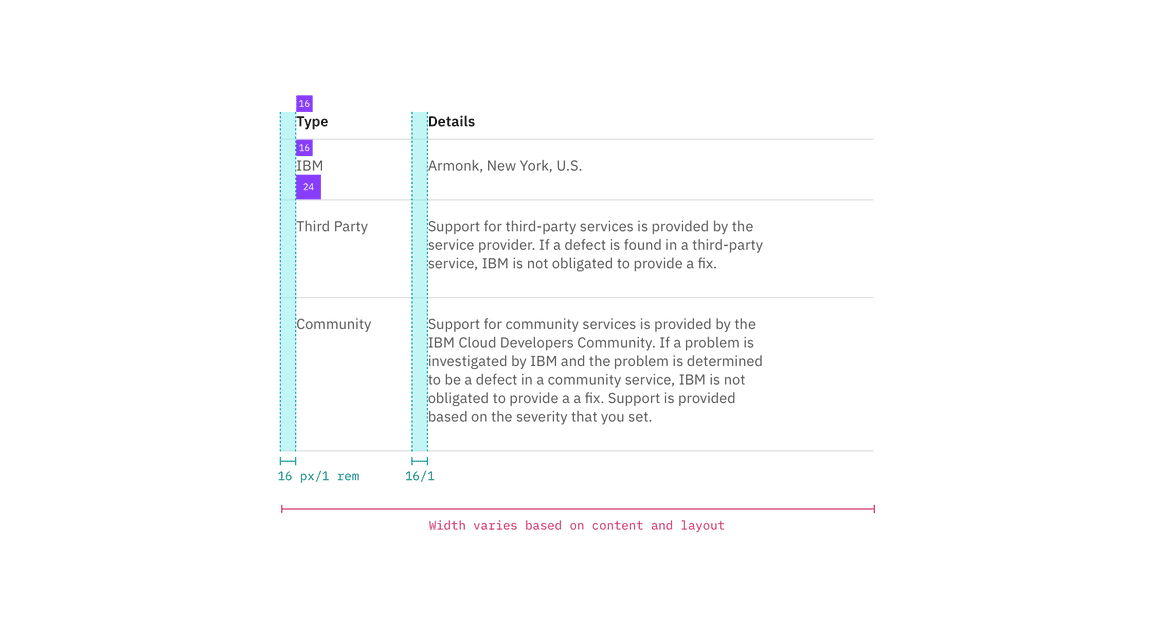
.bx--structured-list-th | padding-top | 16 / 1 | $spacing-05 |
.bx--structured-list-th | padding-bottom | 8 / 0.5 | $spacing-03 |
.bx--structured-list-th | padding-left, padding-right | 16 / 1 | $spacing-05 |
.bx--structured-list-td | padding-top | 16 / 1 | $spacing-05 |
.bx--structured-list-td | padding-bottom | 24 / 1.5 | $spacing-06 |
.bx--structured-list-td | padding-left, padding-right | 16 / 1 | $spacing-05 |
.bx--structured-list-svg | height, width | 16 / 1 | – |

Spacing and measurements for structured list | px / rem

Spacing and measurements for structured list with selection | px / rem